
June 3-5, 2015 (iDigBio API Hackathon) – Team Visualization blog, by Charlotte Germain-Aubrey (FLMNH/iDigBio), Andréa Matsunaga (UF/iDigBio), Chris Neefus (U. of New Hampshire/Macroalgae TCN), Joel Ramirez (The New York Botanical Garden), Aimee Stewart (U. of Kansas Biodiversity Institute/Lifemapper), and Greg Traub (UF/iDigBio):

The visualization team set the development of tools for visualizing changes in species distribution over time as the goal for the hackathon. The team developed two different solutions using different technologies: one expanded the Lifemapper plug-in for Quantum GIS or QGIS (by Aimee Stewart and Andréa Matsunaga), and the other used the iDigBio mapping API (by Greg Traub and Joel Ramirez). By the end of the Hackathon both systems were functional. R script for plotting distribution shift polygons was developed by Charlotte Germain-Aubrey as an additional method to visualize range shifts over time.
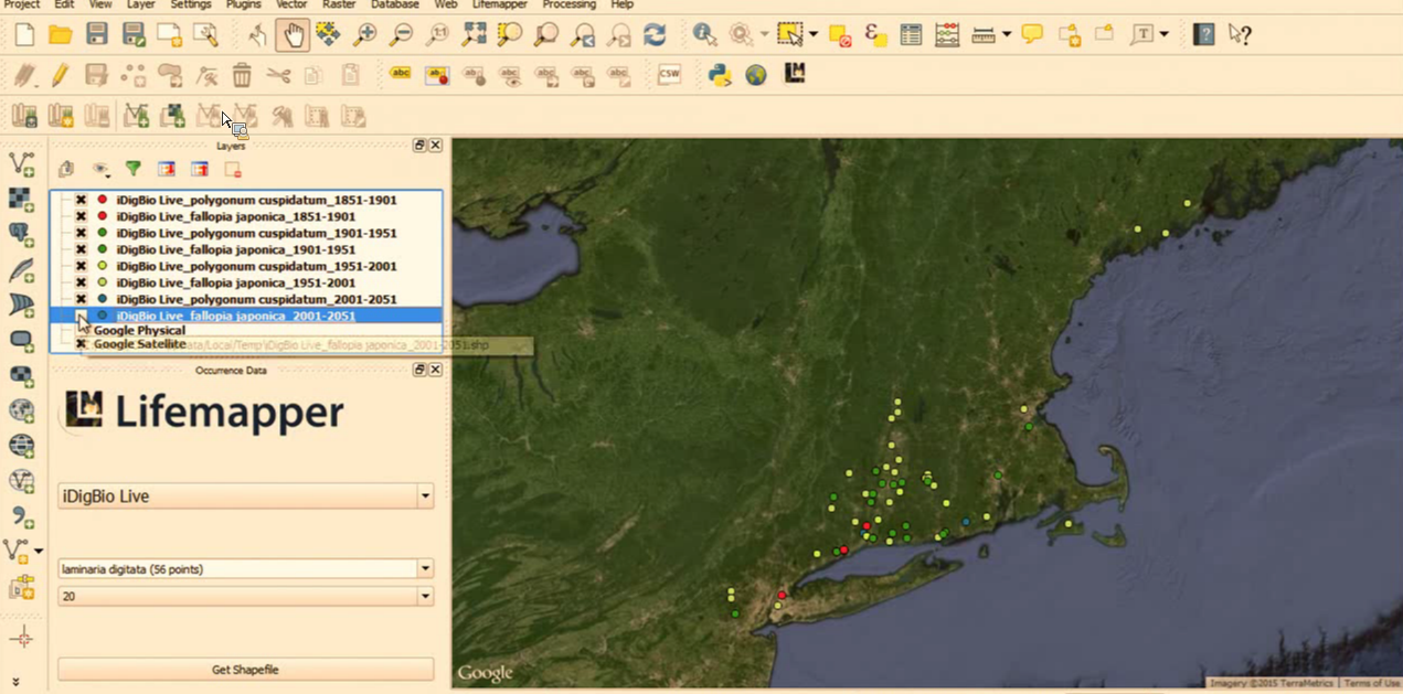
Changes in distribution of two invasive plant species were biodiversity research scenarios developed by Chris Neefus to demonstrate the Lifemapper/QGIS system. The first species was Russian Olive (Elaeagnus angustifolia), a shrub that was introduced as an ornamental plant in the central and western US in the early 1900s. The Lifemapper QGIS plugin developed during the Hackathon has pull-downs to select specimen data source (iDigBio Live was chosen), species (if you start to type in Eleagnus, it will retrieve possible matches as you type), and time interval (20 years was selected for the demo). When the “Get Shape File” button is pressed it retrieves specimen records for each time interval from the iDigBio Live database and plots each set as a separate layer with a different color symbol. A base map layer can be added by pulling down the Web->Open Layers plugin->Google Maps. See the screen shot below.

Once the specimen records are displayed, it can be helpful to hide all the layers except the earliest and then unhide each one in order to see how the species has spread over time. It is important to keep in mind that this is actually showing the accumulation of collected specimens over time, which may or may not reflect an increase in species abundance.
As another example, we used the tool to examine the spread of Japanese Knotweed (Fallopia japonica, aka Polygonum cuspidatum), a very aggressive invasive plant that was introduced as an ornamental in the late 1800s. It spreads through expansion of its root system and is extremely hard to eradicate. It has a very negative effect on residential property values. Since the specimens of this species are listed under two distinct names (P. cuspidatum is an older synonym), it was necessary to search for each one separately and then edit the properties of the layers so that the color of the symbols of both species match for each time slice. From the screenshots of specimens collected in the Northeast US, it easy to follow its progression up the Connecticut River Valley and then wide dissemination into northern New England.
To reproduce the above experiment:
-
Install QGIS, an open source and free product with same functionality as ESRI’s ArcGIS, from http://www.qgis.org/en/site/forusers/download.html
-
To enable Lifemapper QGIS plug in go to https://github.com/idigbio-api-hackathon/idigbio-lifemapper and click on the Download ZIP and save it to a workspace on your machine.
-
Expand the ZIP and save the folder lifemapperTools under the QGIS plugin folder (on a WIndows machine you’ll find it under C:\Users\<yourname>\.qgis2\python\plugins). In the future, when in production, the plugin will also be available through the option “Plugins->Manage and Install Plugins” in QGIS.
-
Once the plugin is installed, you will see a Lifemapper icon placed in your toolbar. Clicking on this icon, a panel to interact with the plugin will open as shown below.

Developers may want to open the python console in QGIS, and follow the queries that are being performed by the plugin against the iDigBio API. In a nutshell, it makes use of the iDigBio summary API to provide the auto-complete functionality, and then it uses the iDigBio query API to search for specimens with scientific names prefixed with the selected species, in the selected time range, with geographical coordinates and sorted by year range. The responses from the API are then converted into shapefiles and displayed in QGIS as layers. To manipulate the layers, follow the instructions from the QGIS manual. If you would like to explore species distribution modeling tools offered by Lifemapper, these layers can be submitted for processing by Lifemapper.

The species distribution modeling within an interval of time using a browser was developed using Leaflet Javascript library, and the code is available at https://github.com/idigbio-api-hackathon/map-distribution-slicer for you to try. Similar to the QGIS plugin, the user can a query on species, genus, family, initial date and ending date, and interval of years to specify bins (each interval is displayed with a specific color).


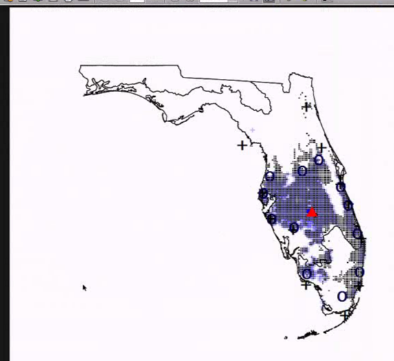
The species distribution shift quantification and visualization was developed in R (https://github.com/charlottegermain/Niche-Shift-Circular-diagram) and generates radial maps of distribution shifts as shown below. The movement script is calculating the distance between the geomean of a species distribution and the ‘edge’ for each of x wedges in a circular representation. The edge is defined as the geomean of the 20 furthest points in each wedge from the geomean. The distance of that edge from the coast is also calculated in order to take the ability of the edge of a distribution to shift in time or not.
Once we do this for two different times (or more, which then becomes several pairs of times that get represented) for one species (or many), we can calculate the shift of the distribution in each wedge to form a circular plot to visualize the shift through time. Each species can also be represented by plotting the edge points on a map for different times and look at the shifts in edge and geomean, as well as total area of the distribution.

Future developments include: adding support for multiple species or families to the web version of specimen distribution visualization over time to allow correlations to be examined, inclusion of other map layers (e.g., climate, precipitation, and altitude) into the web version of specimen distribution visualization over time, integrate the radial map with distribution shift script into the QGIS plugin (some preliminary work to enable use of R scripting language in QGIS during the hackathon indicates the need to install the plugin called “processing” and R). Finally, to enable visualization of distributions over time of the year (e.g., to study floristic patterns by seasons), a request to create two fields (startDayOfYear and endDayOfYear) that are derived from dwc:eventDate in the form of day of the year (a value between 1 and 366) that is indexed as integer was added into the iDigBio API wish list.
Go back to read the other reports.


